
Introduction
In this article we will learn how to leverage the power of LLMs running on google collab to analyze and visualize data. By the end of this article you will be able to load data from a csv file into pandas dataframe and gain insights into your data. To build this POC we will use famous titanic data set, Google Collab to install ollama and llama3 as our LLM.
Step 1 : Initialize and run llama3 on Google Collab
Please follow below post to install ollama and run LLMs on Google Collab
Step 2: Install and import all python dependencies needed
!pip install pandas pandasai streamlit

from pandasai.llm.local_llm import LocalLLM
import streamlit as st
import pandas as pd
from pandasai import SmartDataframe
Step 3 : Load model
model = LocalLLM(
    api_base="http://127.0.0.1:11434/v1",
    model="llama3"
)
Step 4: Load data from csv file into DataFrame
data = pd.read_csv(“/content/titanic.csv”)
Step 5: Load data into a Smart dataframe
This is just a wrapper over pandas dataframe which hides lots of abstractions and make it easier to quickly start on data analysis. We are passing our dataframe and llm model as inputs
df = SmartDataframe(data, config={"llm": model})Step 6: Let the Data Analysis begin
To start with, I asked LLM to answer some very basic questions
df.chat("how many rows are there in dataset")

There are 891 rows in the dataset.

df.chat("how many people have more than 3 siblings")
{'type': 'number', 'value': 30}
30

df.chat("return the percentage of passengers by gender")
The percentage of male passengers: 64.76%
The percentage of female passengers: 35.24%
The percentage of male passengers: 64.76%\nThe percentage of female passengers: 35.24%
Data Visualization
Our model correctly answered all the basic questions, so now is time to ask some more interesting questions. So next I asked for it to draw a basic chart and was impressed with the response
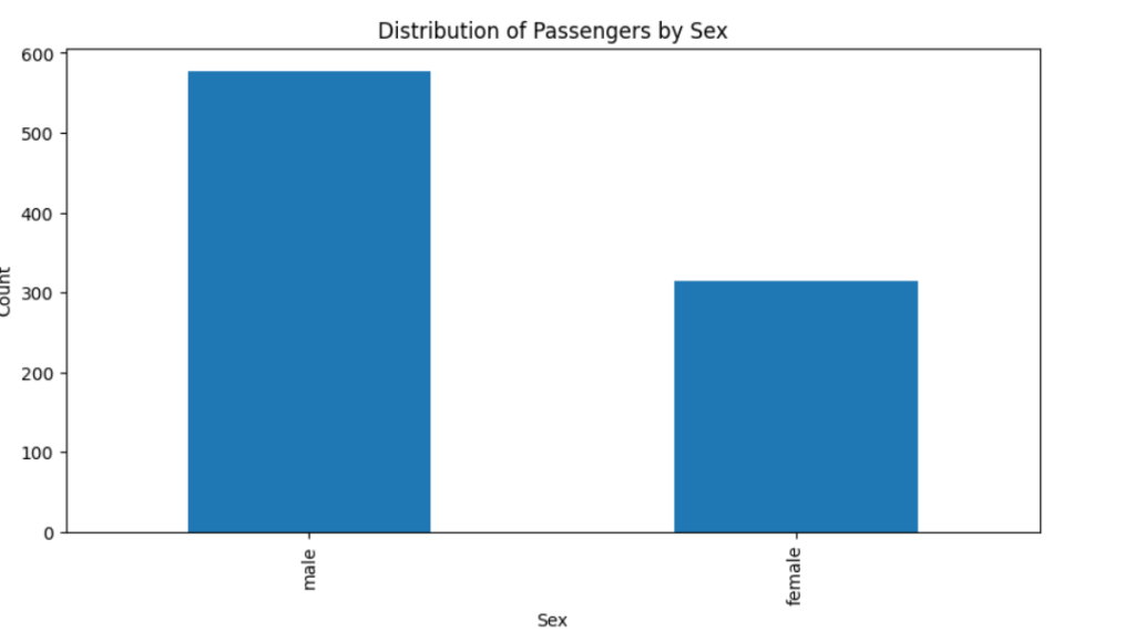
df.chat(“draw a bar chart of sex column”)
To continue with visualization of our data, next I queried for multiple graphs, increasing difficulty with each step:
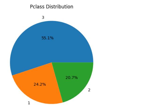
df.chat(“plot a pie chart of pclass column”)
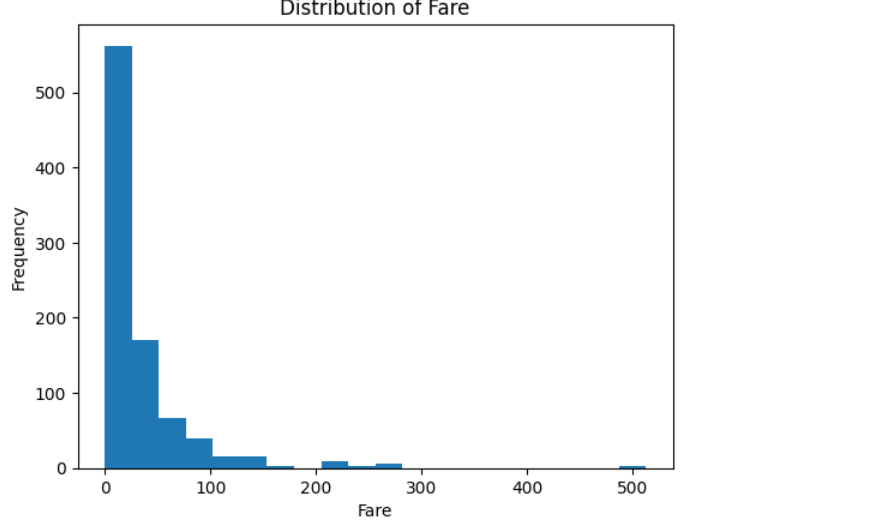
df.chat(“visualize the distribution of fare column”)
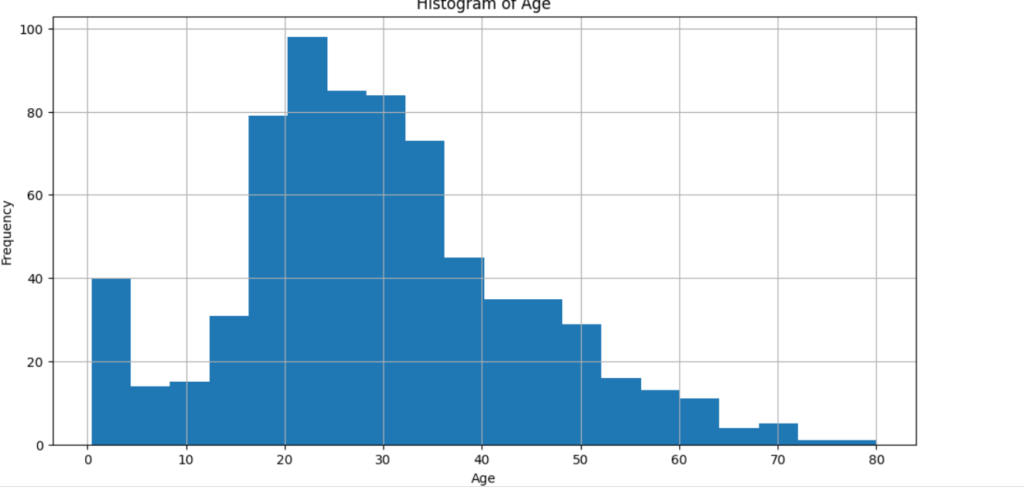
df.chat(“draw histogram of age column”)
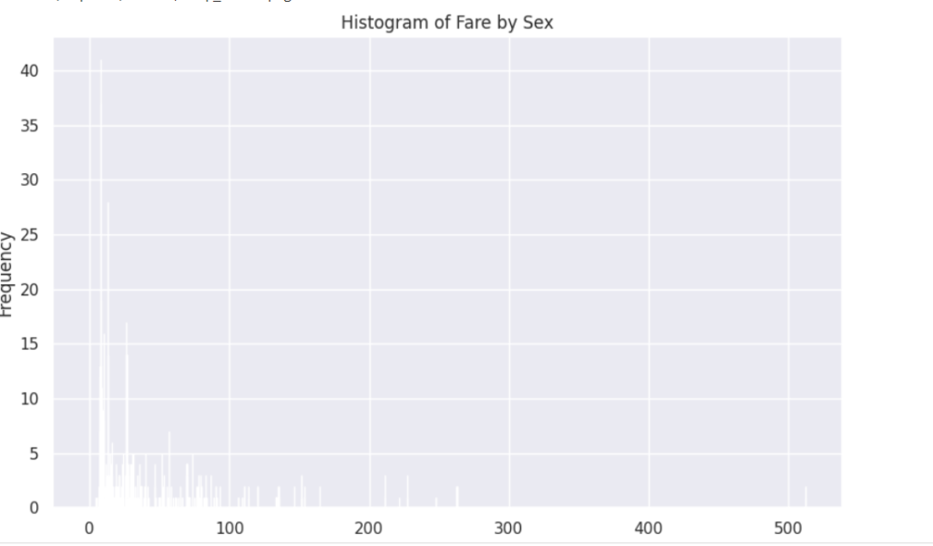
df.chat(“draw histogram of fare column separated by sex column”)
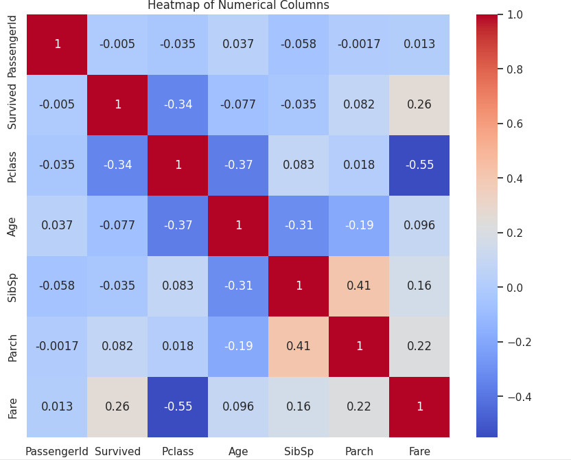
df.chat(“draw heatmap of numerical columns”)
Conclusion
To conclude this post, I can say that LLMs can be used from basic data analysis to creating advanced data visualization tools and can empower the end user to directly interact with the data without the need of developers or other fancy tools.